Power BI Reports for Smarter Decisions and Actionable Insights

Power BI Scoreboard for Tracking European University Strategy
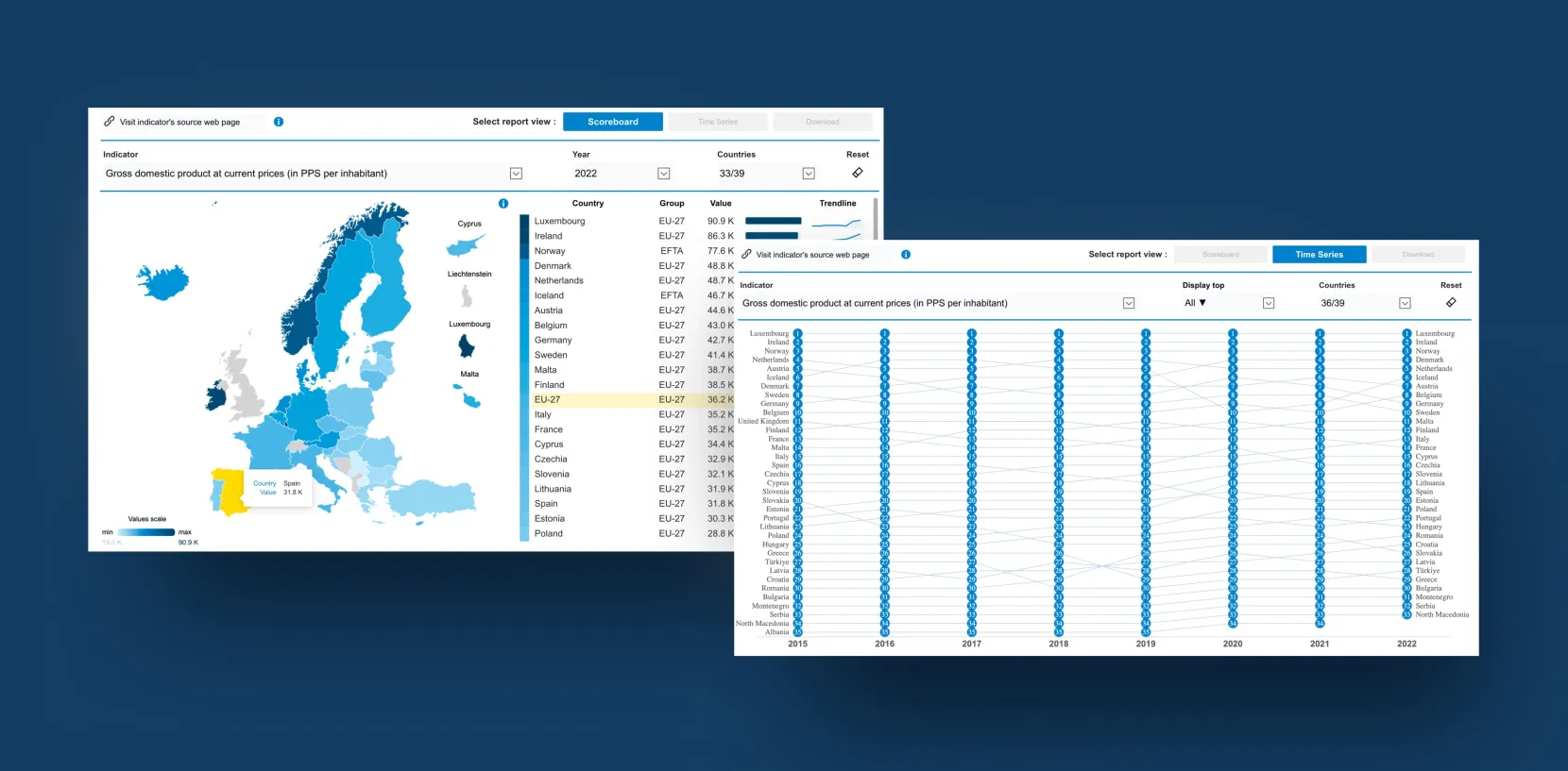
The client approached us with a request to create a Scoreboard in Power BI to track the objectives of the European Strategy for Universities (ES4U). This tool, designed for policy users and stakeholders, must present data clearly and easily. The goal was to visualize indicators for comparisons, provide interactive features for deeper exploration, and embed the tool within the EACEA’s National Policies Platform.
Meeting Deadlines and Power BI Limitations
One of the challenges was meeting the client’s deadline for launching the scoreboard. We needed to gather their requirements and incorporate their requests despite Power BI’s limitations. Additionally, we had to develop our own solutions to implement certain features that were not natively supported in Power BI.
Advanced Power BI Visualization with TopoJSON
Reports that display various indicators at the country level, using data from sources such as EUROSTAT and ETER. The challenge was creating an advanced, customized Power BI solution incorporating TopoJSON files to meet these needs. We chose TopoJSON files because they efficiently manage complex geographic data. This allowed us to create interactive maps with detailed information about countries and their outermost territories, making our reports more accurate and comprehensive.
Power BI Reports for Data Integration and Higher Education Insights
Data Integration & Modeling
The database comprised multiple sources, including EUROSTAT, ETER, EUROSTUDENT, EUROGRADUATES, EUA, and OpenAlex.
Once the data was imported into Power BI, we used Power Query to clean and transform it, ensuring accuracy and consistency. This step was essential for preparing the data for analysis. Then, we built a detailed data model to organize the dataset, allowing for deeper exploration and the creation of meaningful visualizations.
Visualization & User Experience
The biggest challenge was making the reports both informative and easy to navigate. Power BI’s native capabilities were not sufficient for the level of detail and interactivity the client needed, so we developed custom visuals tailored to their use cases and implemented advanced filtering logic. This allowed us to present complex information in a clear, intuitive way while maintaining a seamless user experience.
The final Power BI reports include:
- Detailed scoreboard visualizations for key higher education metrics
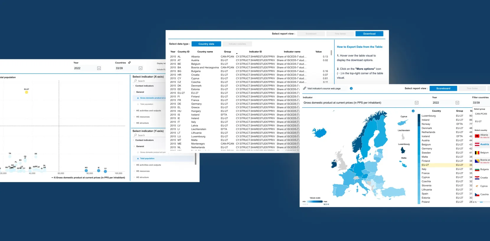
- Shape maps and country-specific indicators for regional comparisons
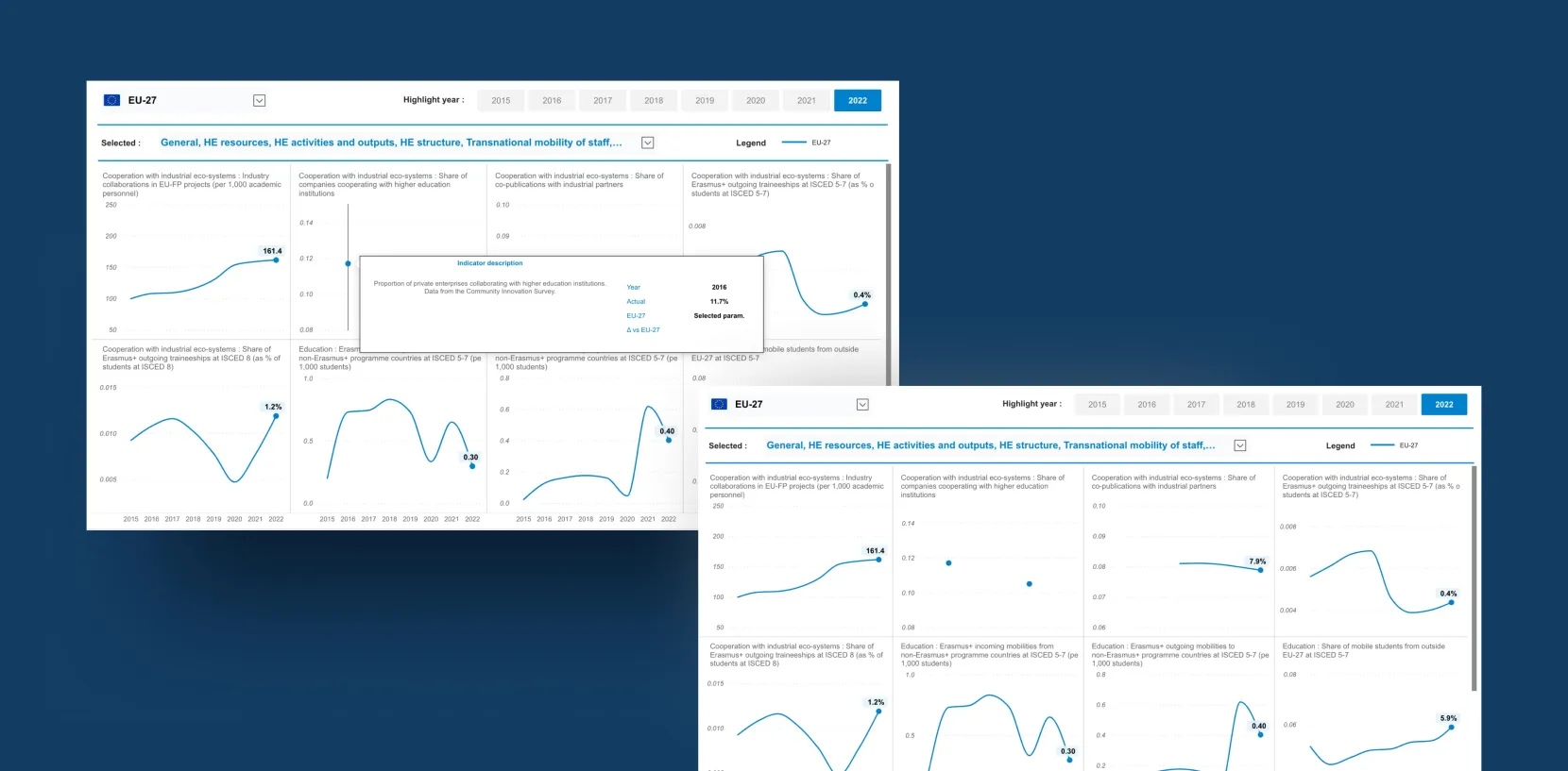
- Trend analysis over time, providing insights into long-term developments
- Custom visualizations for outermost territories, addressing specific policy needs
Additionally, we delivered:
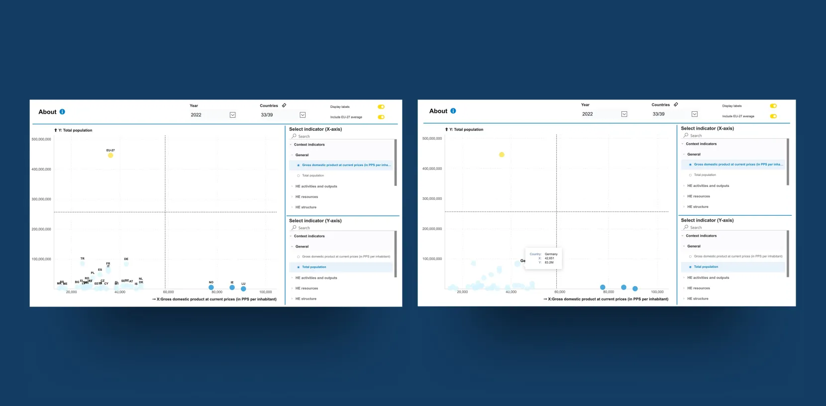
- A dedicated correlation page using a scatterplot, allowing users to compare selected countries based on a chosen indicator and better understand relationships between their values.
- A new download page enabling users to export the exact dataset they are currently working with, including all applied filters and selections.
- An EU27 country-level view, allowing users to compare any institution against the aggregated average of all EU member states.
These reports are now a key component of the European Higher Education Sector Scoreboard, providing policymakers and stakeholders with clear, actionable insights.
Testing and Visualizing Outermost Territories in Power BI Reports
Following the initial rollout, we continued improving the solution through multiple development cycles. Based on user feedback and new analytical needs, we expanded the scoreboard with an additional report (correlation page) and enhanced existing reports with the EU27 overview and a download page. These iterations strengthened overall navigation, improved user experience and clarity, and increased interactivity across the tool, enabling users to work with the data more effectively.
Power BI Reports: Turning Complex Data into One Clear Format
As a result, we developed seven different types of reports using Power BI, which are publicly available on the designated website. In addition, we created a dedicated download page where users can easily access and download the underlying datasets. These reports include:
Five thematic views:
- Transnational cooperation in Europe
- EU values
- Future-proof skills and cooperation with industrial ecosystems
- International cooperation
- Context indicators
One “Country Pages” report
- displays the key indicators for each selected country.
- EU27 Page
We introduced a new EU27 page that displays the aggregated average across all member states, giving users an additional benchmark for interpreting results and making indicator comparisons more intuitive.
One "Correlation Pages" report
The latest and most advanced addition to the solution. Its purpose is to enable users to compare selected countries across two indicators simultaneously through an interactive scatterplot. Users can choose any pair of indicators for the X and Y axes, and the visualization dynamically displays how countries are distributed across quadrants.
The colour-coded layout clearly highlights relative country positions, making it easy to identify patterns, outliers, and relationships between indicators. This standalone view provides a powerful new way to explore correlations and better understand performance differences across Europe.
A major achievement of this project is transforming a large volume of complex data into a simple, easy-to-understand format. This allows stakeholders and policy users to analyze and utilize the data more effectively. Now, they have organized actionable insights that support better decision-making and more efficient policy implementation.
Our solution provides interactive visuals that enhance usability, improve clarity, and enable detailed data exploration. The reports are designed to be user-friendly and intuitive, ensuring accessibility for a wide range of users. The main capabilities of the report are:
Cross-filtering between visuals:
Enabled synchronized filtering between the Deneb EU map, Deneb map for small states, and the matrix table in the Scoreboard View. Selecting any element in one visual now automatically filters the others. The selected areas are also visually highlighted on both maps for better clarity.
Dynamic update of country selection in time-series view:
Adjusted the country slicer behaviour so that when the user narrows the TOP N selection in the time-series visual, the slicer automatically updates to reflect only the displayed countries. This prevents confusion and ensures accurate interaction for the end user..
Get in Touch with Us
Fill in this form, or, if you prefer, send us an email. Don’t worry, we’ll send you an NDA and your idea will be safe.
